We have to go back...to the Photoshop.

 on my bday with Mcfly!
 06-27-2012, 04:33 PM
#5


Reply
 0
0

0

 06-27-2012, 05:09 PM
#12
Boost Czar


iTrader: (62)
Join Date: May 2005
Location: Chantilly, VA
Posts: 79,493
Total Cats: 4,080
Reply
0
0
 06-27-2012, 05:42 PM
#14
Boost Pope

iTrader: (8)
Join Date: Sep 2005
Location: Chicago. (The less-murder part.)
Posts: 33,020
Total Cats: 6,588
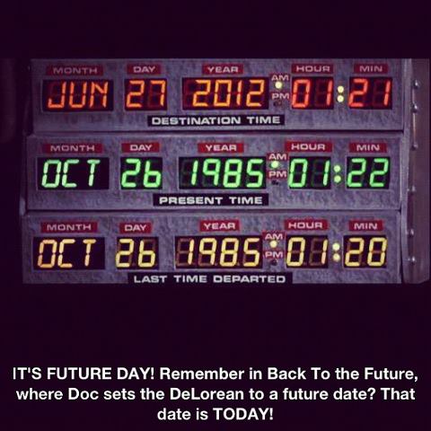
My first thought:
"Huh? I can clearly hear Doc's voice as he pronounces the year as Twenty FIF-TEEN in my head"
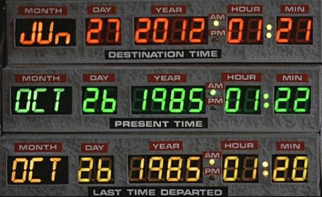
Then I looked more closely. The month / day / year in the top display are a different color from the the hour / minute. The shape of the characters (width, stroke thickness, separation between segments) doesn't match the lower displays, and the focus is sharper.
The leftmost "2" and "0" in the upper year isn't even properly aligned with the unlit segments behind it. Specifically, the "1" in 2012 is kerned. That 1 should be occupying a full-width character slot, but it isn't. This is a proportional typeface which has been right-justified. And the "N" in JUN displays a diagonal stroke which would be impossible to achieve given the style of display in use. Ditto the serif on the J.
If he really wanted to be convincing, he could have pieced together a better forgery by cloning existing character segments.
In all honesty, who in the hell would bother creating this sort of forgery when you're sure to be found out? Is it really that hard to just wait three more years?
Idiocy...
"Huh? I can clearly hear Doc's voice as he pronounces the year as Twenty FIF-TEEN in my head"
Then I looked more closely. The month / day / year in the top display are a different color from the the hour / minute. The shape of the characters (width, stroke thickness, separation between segments) doesn't match the lower displays, and the focus is sharper.
The leftmost "2" and "0" in the upper year isn't even properly aligned with the unlit segments behind it. Specifically, the "1" in 2012 is kerned. That 1 should be occupying a full-width character slot, but it isn't. This is a proportional typeface which has been right-justified. And the "N" in JUN displays a diagonal stroke which would be impossible to achieve given the style of display in use. Ditto the serif on the J.
If he really wanted to be convincing, he could have pieced together a better forgery by cloning existing character segments.
In all honesty, who in the hell would bother creating this sort of forgery when you're sure to be found out? Is it really that hard to just wait three more years?
Idiocy...
Last edited by Joe Perez; 06-27-2012 at 08:25 PM. Reason: schpelling
Reply
0
0
06-27-2012, 06:17 PM
#15
Boost Pope
iTrader: (8)
Join Date: Sep 2005
Location: Chicago. (The less-murder part.)
Posts: 33,020
Total Cats: 6,588
Here, I just did a quickie version of what that panel should have looked like. Note that the colors are correct and the segments are properly aligned:
And for comparison:
If you're going to falsify historical records (even fictional ones) at least put some friggin effort into it...
And for comparison:
If you're going to falsify historical records (even fictional ones) at least put some friggin effort into it...
Reply
0
0

 06-28-2012, 12:04 PM
#18
Boost Pope
iTrader: (8)
Join Date: Sep 2005
Location: Chicago. (The less-murder part.)
Posts: 33,020
Total Cats: 6,588
I did a lot of forging in my youth, so I have kind of a special appreciation for well-executed examples, and harbor a special opprobrium for those done lazily and in haste.
Reply
0
0