MegaSquirt, Scatter Plots, and You
 12-07-2012, 04:29 PM
#1
Supporting Vendor


Thread Starter
iTrader: (33)
Join Date: Jul 2006
Location: atlanta-ish
Posts: 12,659
Total Cats: 134
Andy Whittle shows how to capitalize on MegaLogViewer's ability to create scatter plots. If you don't understand the plot below or why you should use the plot below, see the following link:
http://www.ncs-stl.com/tuning/

http://www.ncs-stl.com/tuning/


Reply
 2
2

2
12-07-2012, 06:22 PM
#2
Elite Member
iTrader: (1)

Join Date: Jun 2006
Location: Warrington/Birmingham
Posts: 2,642
Total Cats: 42
Great read thanks for posting Ben
Still don't understand scatter plots tho, I feel like an idiot saying this, but the author keeps mentioning the z axis, but where is it?!?
Still don't understand scatter plots tho, I feel like an idiot saying this, but the author keeps mentioning the z axis, but where is it?!?
Last edited by richyvrlimited; 12-07-2012 at 06:47 PM.
Reply
0
0
![[Ode]'s Avatar](data:image/svg+xml;utf8,<svg xmlns='http://www.w3.org/2000/svg' viewBox='0 0 50 50'><circle class='avatar-circle-default' fill='%23929842' cx='25px' cy='25px' r='20px'></circle><text class='avatar-text-default' x='49%' y='53%' fill='white' text-anchor='middle' alignment-baseline='middle'>[</text></svg>) 12-12-2012, 05:13 AM
12-12-2012, 05:13 AM
#5
Junior Member

Join Date: May 2011
Location: UK
Posts: 47
Total Cats: 0
which says to me that the plots up there aren't the best examples... why would GEGO or AFR error change as a result of MAP or RPM?
Here are a few that I found a bit more interesting... Would need a longer log (with some higher loads) to make it really useful but at least the axis tell you something.
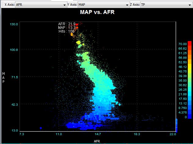
Here are a few that I found a bit more interesting... Would need a longer log (with some higher loads) to make it really useful but at least the axis tell you something.
Reply
0
0
12-12-2012, 08:29 AM
#7
Elite Member
iTrader: (1)
Join Date: Jun 2006
Location: Warrington/Birmingham
Posts: 2,642
Total Cats: 42
Nope all I see is squiggly lines, I really can't comprehend anything from these graphs :(
How are those showing me anything different from say looking at MLV and following an AFR, MAP, RPM and TP trace?
How are those showing me anything different from say looking at MLV and following an AFR, MAP, RPM and TP trace?
Reply
1
1
12-13-2012, 11:54 AM
#8
Junior Member
Join Date: May 2011
Location: UK
Posts: 47
Total Cats: 0
they show you the whole trace in one picture, and allow you to see every instance of the combination of a number of factors, for example the first graph i put up shows how my AFR changes with MAP, and the throttle position at each point. The second shows my AFR over the entire speed/load range.
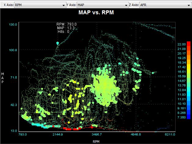
and you can switch the same parameters into different axis for example this is the same data as the first graph.
in MLV you can see an overlay of different traces but it's over a much smaller time period and is much more difficult to assess over the entire log how each parameter directly relates to the other.
Reply
0
0
12-13-2012, 05:11 PM
#9
Junior Member

Join Date: Sep 2011
Location: finger lakes NY
Posts: 433
Total Cats: 17
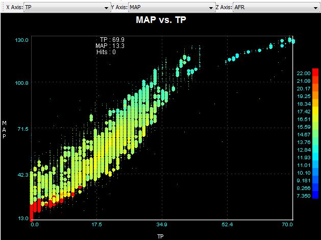
The MAP vs TP graph makes sense. The shape is more or less what I'd expect, but I still have one question: what do I do with it? Other than being briefly interesting, what good is it?
Reply
0
0
12-14-2012, 06:26 AM
#12
Elite Member
iTrader: (1)
Join Date: Jun 2006
Location: Warrington/Birmingham
Posts: 2,642
Total Cats: 42
Why do I care what the engine has done over my entire commute? When we tune, we tune specific areas of the VE/ign table do we not?
Take AFR for example, I fully expect the AFR to have gone all the way from 11.8:1 to 20:1 during a full log, All a scatter plot would show me is if it went richer or leaner than that, but then I could also tell that from MLV by looking at the max/min values?
I really fail to see the point other than they look 'pretty'.
Talk to me like a 6 year old learning maths for the first time

Reply
0
0
12-14-2012, 06:29 AM
#13
Elite Member
iTrader: (1)
Join Date: Jun 2006
Location: Warrington/Birmingham
Posts: 2,642
Total Cats: 42
they show you the whole trace in one picture, and allow you to see every instance of the combination of a number of factors, for example the first graph i put up shows how my AFR changes with MAP, and the throttle position at each point. The second shows my AFR over the entire speed/load range.
and you can switch the same parameters into different axis for example this is the same data as the first graph.
in MLV you can see an overlay of different traces but it's over a much smaller time period and is much more difficult to assess over the entire log how each parameter directly relates to the other.
I don't understand how that's easier than loading up MLV and jumping to an area of the graph that has the above values? You'll also actually know the AFR rather than squinting to check you have the correct colour.
Reply
0
0
12-14-2012, 07:46 AM
#14
Junior Member
Join Date: May 2011
Location: UK
Posts: 47
Total Cats: 0
it's just a quick way to check that everything is looking ok - a picture of how your engine behaved over your entire drive. you can't do that in MLV.
it's also a check that you haven't got any funny relationships between TP or MAP and AFR, or even between TP and MAP, or just that there aren't any areas in the speed / load map that need further attention.
Otherwise you're sitting through half an hour of log playback trying to digest all the information that's coming in and remember it over the entire log.
the min / max afr is of absolutely no value, that's not what you're trying to find out - a scatter plot gives you much more info than that
Reply
0
0

Thread
Thread Starter
Forum
Replies
Last Post
Zaphod
MEGAsquirt
47
10-26-2018 11:00 PM
Johnny Tater
MSPNP
1
09-27-2015 12:38 AM


