Weird bold forum font in Chrome


Thread Starter

Joined: Jul 2009
Posts: 7,388
Total Cats: 474
From: Jackson, MS
So yesterday, without any warning, the default internet font for certain forums changed in Google Chrome. Compared to the normal font, it looks bolder, and slightly out of focus.
Has anyone ever seen this before? I've uninstalled and reinstalled Google Chrome already.
Here's what I'm talking about. This is what MT.net looks like in Firefox (and what it looked like in Chrome up until yesterday.
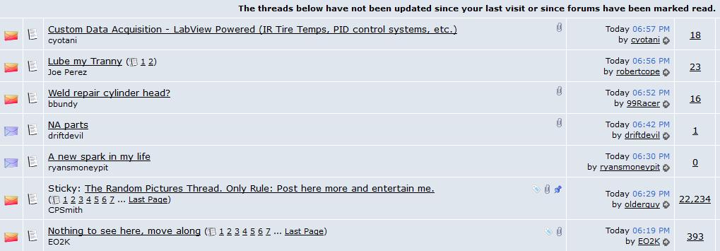
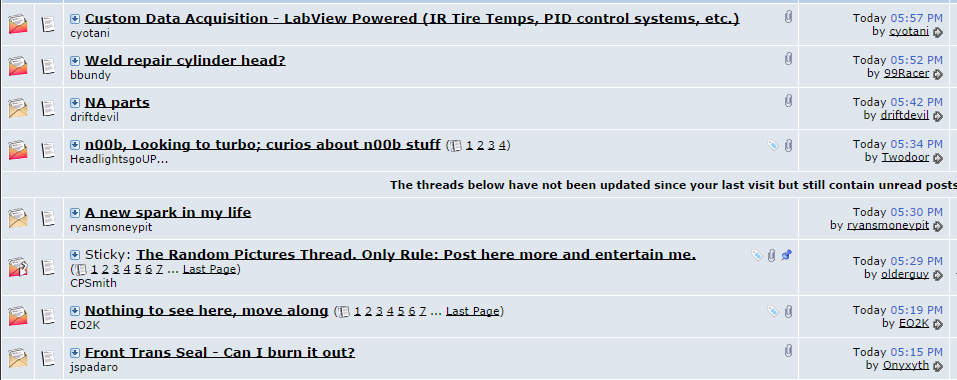
And what it looks like in Chrome now.
Has anyone ever seen this before? I've uninstalled and reinstalled Google Chrome already.
Here's what I'm talking about. This is what MT.net looks like in Firefox (and what it looked like in Chrome up until yesterday.
And what it looks like in Chrome now.
Reply
 0
0

0

Not to do with this is it?
AnandTech | Google Updates Chrome To Version 37 With DirectWrite Support
Granted directwrite should make it look better not worse....
AnandTech | Google Updates Chrome To Version 37 With DirectWrite Support
Granted directwrite should make it look better not worse....
Reply
1
1
Thread Starter
Joined: Jul 2009
Posts: 7,388
Total Cats: 474
From: Jackson, MS
I don't think so -- the change happened on whatever previous version of Chrome I was running, and I didn't accept any update on that day. And then I uninstalled the old version and installed the newest 64bit version, with no difference.
Preliminary research indicates that this issue is sometimes a conflict between a browser's default fonts and the system fonts, but I can't pin down exactly what. Anyone happen to know what the default vBulletin font is?
Preliminary research indicates that this issue is sometimes a conflict between a browser's default fonts and the system fonts, but I can't pin down exactly what. Anyone happen to know what the default vBulletin font is?
Reply
0
0

Joined: Sep 2005
Posts: 34,429
Total Cats: 7,548
From: Chicago. (The less-murder part.)
The majority of this site is rendered in 10pt Verdana.
The screenshot you posted is how the site has looked to me, in both Chrome and Firefox, for as long as I can remember. Specifically, threads which contain unread posts are rendered in bold, while threads in which there have been no new posts since you last entered them are not. Judging by the notes in your screenshots, it seems that your browser is functioning correctly.
The screenshot you posted is how the site has looked to me, in both Chrome and Firefox, for as long as I can remember. Specifically, threads which contain unread posts are rendered in bold, while threads in which there have been no new posts since you last entered them are not. Judging by the notes in your screenshots, it seems that your browser is functioning correctly.
Reply
0
0
Thread Starter
Joined: Jul 2009
Posts: 7,388
Total Cats: 474
From: Jackson, MS
It's different. Here's how it looks on my work laptop (and this is how it used to look on my home desktop in Chrome).
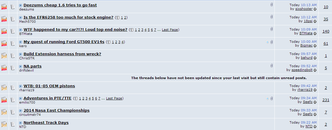
And for reference, how it now looks on my home desktop in Chrome.

And for reference, how it now looks on my home desktop in Chrome.
Reply
0
0
Thread Starter
Joined: Jul 2009
Posts: 7,388
Total Cats: 474
From: Jackson, MS
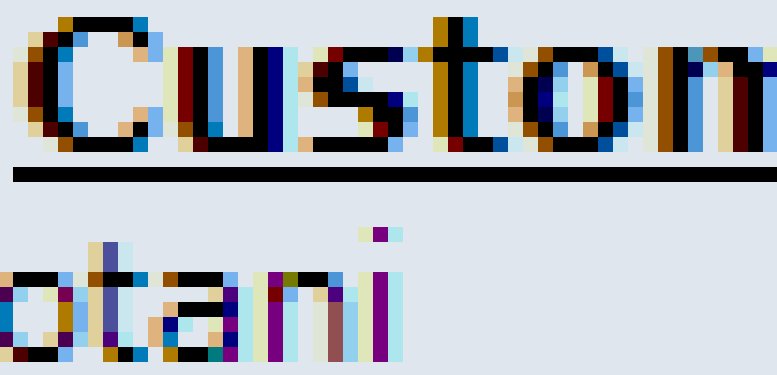
Okay, I zoomed in for a better comparison.
1. Work laptop in Chrome. Looks the same as it used to in Chrome on my home desktop, and how it still looks in Firefox on my home desktop.

2. Home desktop in Chrome. Text is bold but not as crisp. Hypertext underlining collides with the bottom of the letters.

1. Work laptop in Chrome. Looks the same as it used to in Chrome on my home desktop, and how it still looks in Firefox on my home desktop.
2. Home desktop in Chrome. Text is bold but not as crisp. Hypertext underlining collides with the bottom of the letters.
Reply
0
0

Thread Starter
Joined: Jul 2009
Posts: 7,388
Total Cats: 474
From: Jackson, MS
And the text isn't crisp and sharp. It's not as apparent in the screencaps, but the zoomed in caps should show it better.
And yes, I know this doesn't seem to be a big deal. I just don't like it when things change on my computer for no apparent reason. And while it's not that critical, I would like my internet fonts to appear crisp and clear, not fuzzy-edged and obscured by the hypertext underlining.
And yes, I know this doesn't seem to be a big deal. I just don't like it when things change on my computer for no apparent reason. And while it's not that critical, I would like my internet fonts to appear crisp and clear, not fuzzy-edged and obscured by the hypertext underlining.
Reply
0
0
Joined: Sep 2005
Posts: 34,429
Total Cats: 7,548
From: Chicago. (The less-murder part.)
His two browsers are also using a different antialiasing algorithm. Traditionally, Windows uses ClearType to smooth the edges of text. DirectWrite added an additional mechanism, called YDirection.
I've blown up his two examples above so you can see with greater ease how the edges of the characters are handled differently under the two renderers:
vs:

I suspect that a lot of this depends on the monitor. I'm looking at this on a 1920x1080 22" Dell which is about a year old, and while I can clearly see a difference between the two, neither one is really objectionable to me.
Of course, my first exposure to the World Wide Web was on one of these:
.jpg)
Hooked up to one of these:
Reply
1
1

chrome, ff, and ie all render text different.
and depending on your browser it can be 10pt of any of these fonts:
that's pretty much the entirety of the code for the fonts you're talking about. A style of bold gets added to the row the font resides in, but it's attached to the table, not the font itself; and only unread posts.
example:
fonts in Chrome traditionally look much better than IE. I see this when I'm working on cross-browser compatibility on our apps here at work.
and depending on your browser it can be 10pt of any of these fonts:
Code:
font: 10pt verdana, geneva, lucida, 'lucida grande', arial, helvetica, sans-serif;
example:
Code:
<a href="https://www.miataturbo.net/diy-turbo-discussion-14/turbo-na6-under-construction-questions-fuel-mixture-related-80598/" id="thread_title_80598" style="font-weight:bold">Turbo NA6 under construction questions - Fuel mixture related</a>
Reply
0
0
Thread Starter
Joined: Jul 2009
Posts: 7,388
Total Cats: 474
From: Jackson, MS
Here's a tutorial on how to disable DirectWrite in Chrome: How to Improve Chrome Font Rendering in Windows with DirectWrite
And, of course, it immediately made the text in mt.net look terrible like my home desktop. I follow the instructions above to disable DirectWrite, closed and reopened, and it's back to normal.
+1 prop to you, Joe, and 100 points to Ravenclaw.
Reply
0
0
This was it, 100%. Completely confirmed. I opened the chrome://chrome tab and noticed my work Chrome browser was still version 36.something. As I watched, it started an update to version 37.something without asking for permission, and updated automatically when I closed and reopened the browser.
And, of course, it immediately made the text in mt.net look terrible like my home desktop. I follow the instructions above to disable DirectWrite, closed and reopened, and it's back to normal.
+1 prop to you, Joe, and 100 points to Ravenclaw.
And, of course, it immediately made the text in mt.net look terrible like my home desktop. I follow the instructions above to disable DirectWrite, closed and reopened, and it's back to normal.
+1 prop to you, Joe, and 100 points to Ravenclaw.

Reply
1
1
Thread Starter
Joined: Jul 2009
Posts: 7,388
Total Cats: 474
From: Jackson, MS
Yeah, that's my fault -- I had ruled out the possibility that Chrome had updated since it hadn't prompted me to allow the update.
Also, posts without avatars get ignored.
Also, posts without avatars get ignored.
Reply
0
0

Reply
1
1