Miataturbo.net T Shirts *gauging interest*


 12-10-2009, 10:06 PM
#233
Senior Member
iTrader: (4)

Join Date: Jan 2008
Location: Falls Church, VA
Posts: 1,361
Total Cats: 17
I'm not sure what there is to update. I didn't plan on making any other changes to the pic if that's what you mean. As far as I'm concerned Fireindc can start making them, or y8s can add it to the cafepress store, whichever will git er done.

Reply
 0
0

0
12-11-2009, 11:10 AM
#235
Senior Member
iTrader: (4)
Join Date: Jan 2008
Location: Falls Church, VA
Posts: 1,361
Total Cats: 17
I'm not sure a full-res pic was ever posted. The one I had to start with was only 640x480. The exif data says it was originally 3264x2448, and it was probably scaled down by photobucket, so the full-res may only exist offline at the moment. Rotornut, any chance you can you dig through your computer to find the original? It was taken with a Sony DSC-H3 and the file name would be DSC01787.jpg if that helps you find it.
Reply
0
0
12-11-2009, 07:38 PM
#236
Elite Member
Thread Starter
iTrader: (13)

Join Date: Dec 2006
Location: Taos, New mexico
Posts: 6,610
Total Cats: 567

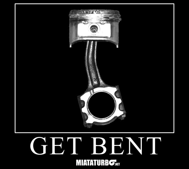
This is my new design. Yes i have a more high res version im going to actually print. No thats not exactly what it will look like, i threw together the text really quick. Input please, which font do you think it should say "get bent" in? Also should it say mt.net at the bottom, on the back of the shirt? Help me make this one good.
Y8's I honestly wouldn't mind if you made your own get bent design and put it on cafepress, but these shirts ARE happening, they WILL be better quality than cafepress, and i will offer hoodies at a much more reasonable price then them. Also buying from me will support a mt.net member instead of some corporation.
Either way im still making these shirts, and i might still do the turbo and crossed rods version as well since i really like it for some reason.
Reply
0
0
12-11-2009, 07:50 PM
#238
Cpt. Slow

iTrader: (25)
Join Date: Oct 2005
Location: Oregon City, OR
Posts: 14,197
Total Cats: 1,136
I'd say pic and words on the front, MIATATURBO.NET on the back. Maybe bend the "get bent" to match the curve of the rod. Could also replace the curved part of the rod with the "get bent" words, but it might be too tall or squished if you shrink it, just an idea.
Reply
0
0
 12-11-2009, 08:07 PM
#240
Elite Member
Thread Starter
iTrader: (13)
Join Date: Dec 2006
Location: Taos, New mexico
Posts: 6,610
Total Cats: 567
And ive g2g to work now, more updates later. Let me know what you think, and feel free to edit the design i posted up to try and make it better. I like the one i just posted up a shitload more than the first one.
Edit: Also on the image above im thinking it might look better with no mt.net logo on the front, and i could just print the logo on the back tail of the shirt or something. I'm not sure what you guys would prefer.
Also the image looks pixalated and shitt, but i assure the original copy is much cleaner, it is however a photoshop file and i cannot upload it here without exporting and losing quality. This image was just to give you guys an idea.
Reply
0
0


